Friday, December 24, 2021

SeeNa


Name:SeeNa
Number:96
Year:1986
Publisher:SystemSoft
Developer:SystemSoft
Genre:Racing
Difficulty:5/5
Time:8 hours

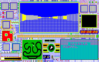
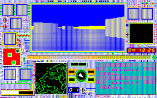
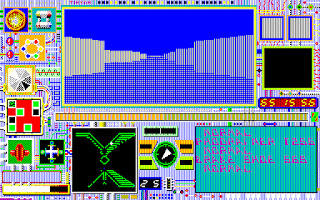
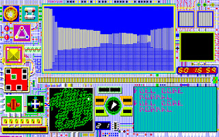
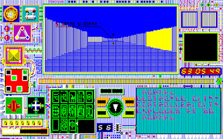
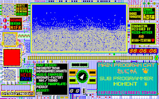
The history of Japanese computer games is a perplexing thing. Sometimes they pointlessly tread the same ground the west has done for years and years, and other times they innovate. SeeNa is one of those innovations. A first-person racing game is nothing unusual, this is far from the first title to do it. However, once you see some screenshots, you'll realize why this is an impressive title.

Behold, a racing game

This is because SeeNa hits upon almost exactly the same notes as Hovertank, Catacomb and all the rest of the untextured FPS titles would do. Now, admittedly, the game is somewhere between a maze game and a racing game, but to see it done much earlier is shocking. Midi Maze, was one year after this, I admit, but SeeNa feels so much more modern. Levels, in the sense I expect them, secrets, secret levels. This doesn't really feel like a commercial game because those usually aren't this impressive technologically.

When the game starts off you have two modes, one called Mode A, and one called Mode B. You can think of this as Adventure Mode and Race Mode. Adventure is effectively the actual game, and Race Mode is what you expect from a racing game. A series of tracks you try to get the fastest time around. I'll start with that mode first.

Note the sections where the track goes back in on itself, this is achieved via teleporters
There are several unusual things about the game even in this mode. The most obvious is the damage meter and the gasoline tanks. Take enough damage, or run out of gas, game over. There's a pit stop so you can repair and refuel. I say gas is obvious, but I didn't figure out that it was a thing until considerable time spent in the game. Mode B was something I didn't play right away. Then you have break and slip zones. Break zones slow you down, slip removes your traction, I.E., turning, speeding up, speeding down, the time between you pressing it and it happening is very slow. But not too dissimilar to slow down zones and ice in other games.

Just your average racetrack
Some of the tracks in Race Mode are weird, and there's no rhyme or reason to where they're placed. One moment you have a normal track, the next your map isn't showing everything there, and then you're in something that wouldn't be out of place in Catacomb Armageddon. Then it finishes with something normal. If you played it after the finishing the other mode, you'd probably be disappointed, because its just a simple time trial, and one that you can't lose; Unless you're a complete beginner at the game.
Behold, a racing game...?

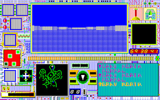
Mode A is where things change from being a racing game with unusual tech, to something interesting. You start off in a room, you turn around, there's nothing here. The only thing unusual is a flashing wall, so you drive through it. Its a map tool and this isn't just some race track. No, this is an actual level, with enemies and things you pick up. Its very unusual to play a racing game like this, and its other features are also unusual. You have limited gas and you need to find pick-ups that restore it. Later on there's a powerup that allows you to recharge it in certain zones, but this is of limited utility.

On top of an enemy, taking damage

But what's striking about this is how you deal with powerups, switches, enemies and the level exit. A lot of this stuff is in the form of flashing walls. You can destroy everything (except level exits) if you pass over it at a certain speed, which is good for enemies and I think switches, but not so good for everything else. Naturally, the game is designed around making this concept as annoying as possible for you, including putting enemies you wish to kill right next to solid walls, which hurt you.

For the early part of the game, level design is interesting. Its unsurprisingly not too dissimilar to the typical FPS, released 5-8 years later. Altered, of course, to accommodate the speed aspect of the game, and no saves. The game doesn't allow you to save, at all, and it isn't all that much worse for the wear for it, at least starting out. The game encourages you to play it in the best way possible, finding items in the correct order, using as much gas as you need, and ignoring places you don't need to travel through.

Every bit of the map is like that, even the parts I haven't uncovered

The level where the game really starts screwing with the player is Saka. Or at least that's one of its names. The level is a series of corridors that resemble train tracks. The sort of turns they put in so they don't tip over. Its a very large, very complex level. There is some fuel, but it is limited in nature. This area has a city, or I guess super computer, you destroy in order to win. It continues the cruelty by hiding the level exit, and possibly causing it to be lost forever if you hit the wrong switch. Destroying the super computer starts a timer, of which you have sixty...something to get out of the level. I eventually manage to win this level...but the game continues. I wasn't expecting that.

One of the secret levels I couldn't beat

But, no, it keeps going. Not just for one level, but for two more, at least. There's even a secret level here. This had me perplexed on many levels, because Saka felt like a proper end to the game, and two, because of the game not having any saves, we're starting to get really long. This isn't annoying for me, because I have save states, but for someone playing on actual hardware or legit? Nuts. You have to get everything right. There are even more super computers to destroy too.

This would be annoying in any game
Unfortunately, I'm forced to put a loss column here for this game, despite almost winning it. Almost. I think. I don't really need to cite anything other than this screenshot, but I'm going to explain. In all of this, I need to find a level exit. I may also need to find a switch to open that door. Which adds the total number of things I need to find, with limited fuel, to 2. In all of this. I remember thinking this would be a fun game to see people speedrun, and while that's still something I'd like to see, I'm not sure if that person is even human anymore. 

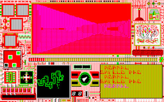
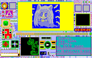
Winning levels show you these pictures, sometimes complete, sometimes mixed in with ones from other levels
The secret levels, at least those I could find, were pretty good as secret levels. I only finished one of them thanks to it being a 1-in-3 chance of automatically winning the level, but I gave the others a valiant effort. Thanks to some incompetence on my part, I'm not sure if that's because I screwed it up or if the game was intentionally designed so that these levels would be unbeatable if I didn't find the right powerups beforehand. I still felt like I had succeeded in doing something when reaching them, which is the important bit.

Mahjong tiles feature heavily in this level, for some reason
Let's talk about the real problem with the game, the audio-visual package. You've seen the pictures. Its very cool seeing this in 1986. However, it is very hard on the eyes in motion. And because of the limited color palette, sometimes the movement looks awkward. Further, the music sounds pretty sweet the first time you play the game, but this game is at least 8 hours long and there's not even 20 minutes of it. There's no way to turn off the sound without changing settings.

Weapons:
None.

Enemies:
Incredibly basic and practically non-existent. 0/10

Non-Enemies:
None.

Levels:
There's a wide gap in the quality of the best levels and the worst levels. Not necessarily because the best levels are the greatest thing ever, but because the worst levels are about as bad as you can possibly get. There is just no point in time where the last level in this game is acceptable. 5/10

Player Agency:
You move smoothly when the game wants you to move smoothly. You don't when they don't. There's a really awkward period at low speeds where you have a really slow turn arc, but not at minimum speed, which is annoying. Otherwise no complaints. 5/10

Interactivity:
Its basically Quake rules, if you were a car. 0/10

Atmosphere:
There aren't many in-door racing games, be they sci-fi or otherwise. It feels like a journey through a futuristic world, even if the story could be about something else entirely. 2/10

Graphics:
Simple, but very interesting for the time. Unfortunately, thanks to the way the game is set-up, it quickly becomes very tedious to look at. The HUD is incredibly busy too, took me a while to figure out what area had my fuel. 2/10

Story:
None in-game, though there could be something in the manual.

Sound/Music:
The sounds are very simple, and the music, while interesting at first, quickly became annoying. 1/10

That's 15. Its an interesting game, but it has several severe flaws. Its an area ripe for new material. Not like some actual racing games some have made in the Doom engine, but something like this, solo, alone in an alien world.

I don't really know how many more titles the lead programmer of this game, Tinyan, has, nor how many SystemSoft have. SystemSoft seems to be the Japanese Microprose, developing original simulations and publishing similar games from other regions.

Thursday, December 16, 2021

Sinistar

After a few seconds, the name floods the screen in a dazzling array of colors

Name:Sinistar
Number:95
Year:1982
Publisher:Williams
Developer:Williams
Genre:Top-Down
Difficulty:5/5
Time:2 hours

Sinistar had an interesting introduction. One of the games I had as FPS for 1987 seemed really questionable, so I decided to put it back in 1987, and instead went for some random 1982 game. Rejected a couple of titles, but then I got to Sinistar. Ah, cool, that's a beloved title, I think to myself. It has an Atari 5200 port I have down, but I'll play the arcade original too. I do my usual research, and discover that the 5200 port is actually from the year 2010. Which gives me some pause.

Now, I realize that I tend to not give credit to early games and their use of sound, since I deal more in home ports than fancy arcade machines. This tends to limit the impact of sound, since the impressive nature of such things tends to be more using limited amounts of space. Sinistar has some fancy voice samples, and apparently its the first to have them in stereo. The home ports being seemingly unlicensed homebrew stuff is significantly more interesting.

Before playing
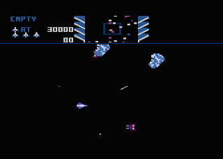
There's the usual excuse story, but the overall objective of the game is to destroy Sinistar, a giant talking ship. To do this one has to mine (shoot) crystals out of asteroids. (called planetoids, but at this size?) In your favor is that each level Sinistar needs to be built by worker ships. Against you are other ships called warriors which shoot at you. Completing all this is collision, because unlike other games which are content to autokill you if you touch something, this just bounces you. Off asteroids, other ships, everything that isn't a shot or Sinistar.
A less chaotic scene

Playing it, it is frantic, utterly mad chaos. The controls are unusual. Turning doesn't quite work in the way you expect it to and you have momentum. I had to break out my joystick for this, playing it with a keyboard just wasn't ideal. Even so, this game doesn't feel precise. The ship you're flying is not precise, it is very loose. These physics seem universal, since if you look at the enemy ships, the workers and the warriors both move very awkwardly, even as they try to complete their own objectives.

Sinistar, slowly getting built
The workers are actually building Sinistar in real time, and your actions effect how they build him. Mine some crystals and if you don't get them quickly enough, the workers steal it and use it to build Sinistar. They're mining crystals of their own, and you can disrupt this process if you're smart. But more likely than not, Sinistar is going to get built, shout off his characteristic "I LIVE" and kill you. You don't have any say in this, at least in the beginning.

A relatively safe scene


There are two phases to each stage of this game, the first is when you are fighting these unending hordes of ships, trying to survive and maybe mine crystals, and the second stage, when Sinistar starts hunting you down. You need at least 13 crystals to take out Sinistar, as these create a special missile attack that homes in on Sinistar, but they can be intercepted by other ships. If you don't have enough, you better hope you get lucky and get some before you see Sinistar appear on your minimap.

I am basically already dead here
See, when Sinistar is built, the game changes from a frantic space shooter to run away from the big scary monster. The voice samples absolutely sell Sinistar. Its something about games like this, when you hear voice samples in a game that you don't expect to have voices in them, the effect is usually unsettling. Combined that with Sinistar's impressive speed and that his touching you is instant death, you have a tricky boss fight. Its the closest we've had to a survival horror game chronologically.

I am dead here, and my remaining lives are just jokes
Now the big problem with this game, and also why its good, is that once Sinistar comes out you need to focus on him. Because he'll make short work of you if you don't. You are screwed if you need more crystals. When he says RUN, you run. You can avoid him through clever movement for a while, but mining crystals, dodging enemies and Sinistar is a lot of tasks to divide your attention among, and usually Sinistar wins. I never beat Sinistar if I haven't gotten enough by that point. Lives don't really matter at that point, because Sinistar crosses the distance surprisingly fast.

The screen goes all crazy whenever you kill Sinistar
Given enough time, its not that difficult to figure out how to kill Sinistar once. You get used to the movement, defeating workers and warriors. But then you get to the second zone, of which there are five, then it loops starting from the second. Each zone after the first has two differences, an increase in a certain aspect of the game (or decrease in the final zone) and Sinistar can be repaired. I did not handle the second zone, which had more workers, very well. It wasn't so much the repairing, as it was the sheer number of targets on-screen.

Excitement?
The Atari 5200 version is interesting, and by interesting I mean wildly inferior. The only plus are difficulty settings. It controls worse, perhaps owing to the less precise nature of the 5200's joystick. The asteroids give out crystals much slower and yet I somehow managed to get 13 of them one game. The whole area is massively smaller. Sinistar himself turns from a menacing figure to being silent and underwhelming. Its just not worth it.

Weapons:
Fairly standard weapons. 1/10

Enemies:
Sinistar is something special. 2/10

Non-Enemies:
None.

Levels:
Perhaps there's something different in the remaining levels, but the two I played really felt like random rocks were placed upon it. I guess there was some logic to it, but it didn't seem that important. 1/10

Player Agency:
Its not the smoothest thing I've played, but after some time with it, it works. It could be a lot worse. It didn't ever feel like I was turning my ship quite right, which I guess is up to par with my usual realistic spaceship experience. 4/10

Interactivity:
I guess you shoot the asteroids, but that's a stretch. 1/10

Atmosphere:
The game conveys a hopeless fight very well. Sinistar will always return, his followers, assuming they are followers and not robots, will always rebuild him. You will eventually falter and lose in this fight, while Sinistar will come back. 6/10

Graphics:
High quality for the era. Its not that special now, but it still looks nice. 3/10

Story:
A token effort.

Sound/Music:
Typical stuff except for Sinistar's taunting. Even though its low quality there's something just more effective about the voice bytes. 2/10

That's 20. Interesting, that's now the highest rated game until 1986. While on his own, Sinistar isn't that impressive, the whole audio-visual package surrounding him is. Its something that we may miss living here in an era where there's no reason for a game not to have voice acting.

There is one sequel, made in 1999, so its entirely possible I'll never reach it. Considering how frantic this was in 2D, I shudder to think how crazy it would be in 3D.

Sunday, December 12, 2021

Dimensional Fighter Epsilon3

Name:Dimensional Fighter Epsilon3
Number:94
Year:1985
Publisher:Bullet-Proof Software
Developer:Bullet-Proof Software
Genre:FPS/RPG
Difficulty:5/5
Time:10 hours 00 minutes

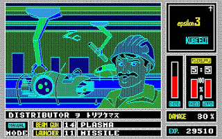
Dimensional Fighter Epsilon3 is the first FPS/RPG hybrid, at least according to what little there is on the game around. Take Wizardry, strip out most of the RPG part, then take a light gun game, add in limited ammo, have battles be the light gun game and the Wizardry-lite be the RPG part. As a result its sort of questionable to call this the first FPS/RPG. Its not really a FPS, and its hard to call it a RPG, since I barely felt like I was gaining any sort of stats.

Published by Bullet-Proof Software, previously mentioned on this blog for Faceball 2000. The man who founded BPS is truly a man of the world. Henk Rogers, born in the Netherlands to Dutch and Indonesian parents, before they moved to New York. He studied computer science at the University of Hawaii before founding BPS in Japan. He's also attached to the American releases of Tetris, becoming friends with Alexey Pajitnov. Unfortunately, I don't know much about the actual developer of this game, one Eiji Kure, except that he likes making RPGs.
Can you spot the enemy here?
This is the first PC-88 game I've really played, so there's a bit of confusing stuff going on. Firstly, none of the emulators I tried have a great screenshot function, nothing bindable, just ALT+F2 or whatever they pick, assuming its useable at all. Secondly, the game had V1 after its file, which I ignored for the first couple of sessions. This was a mistake on my part, because it wants me to play in V1 mode, as the system had modes like that. I don't understand it, but I don't have to. Playing the game in V2 will cause the game to look like an unholy abomination against god and man, and this isn't an appealing-looking game to begin with. There were ghosts of walls.

There's this cool cutscene where the camera slowly moves up the mech and its much nicer than what they drew deserves
The story is the player is controlling the last hope against a superior enemy that wants to eradicate all life. To stop them, the player has to free 3 cities. Starting it up, there are two modes, a play mode and a demo mode. Demo is a demo, but doesn't really show much. The game has a slightly confusing start-up procedure. You need the game disk in one floppy drive and the user disk in the other, otherwise you'll get stuck in an endless loop. From there you pick a city and start playing. That implies you have a choice, but playing anything other than the first city will result in your swift death. This is easy to screw up even when you have some idea of what you're doing. Saving is accomplished by going back to the building you started at and going forward with Numpad 5.
A typical gameplay scene, I'm almost dead, but otherwise in good shape

Visually, it looks like Wizardry, except outside, and kind of weird. You can see about three squares away. Movement is done with the numpad arrows, along with numpad 5 to enter buildings. This is necessary because many, many things are inside these buildings. There are also things you pick up on the ground. You can access a menu with M or change the scenery and enemy colors with F. Its still the kind of game that I feel the need to take frequent breaks from.

A typical battle, I'm not losing yet, but it will happen
It doesn't take long for the meat of the game to happen, combat. This is done like a light gun game, move your crosshair, and then try to hit an enemy's weakspot. As seems to be usual with this sort of game, whether or not you can actually win these fights seems to be as much down to luck as it is skill. Well, more skill than luck than it seems usually. Some enemies seem like they're constantly running back and forth, but they're really just moving because you have your crosshair over them. That's not to say its good, just that it gets...tolerable, I guess.
The screen changes colors as you take damage, this isn't the worst it could be

This runs into the same problems that Death Duel had, the only way to make such a game difficult is to require precision. To achieve precision in a game where I aim a crosshair with my keyboard is something that isn't going to happen. Further, there are nasty things going on, there are mine enemies that move in and out of the ground, you can't hit them while they're in the ground. Some enemies in city 2 I could miss even if my crosshair was on the target. Missiles sometimes took so much time to reach a target I was already at zero shield by the time it hit them, thus negating the point of firing it.

Mines, possibly the most annoying enemy in the game
 As the enemies increase in difficulty it doesn't feel like you get any way of countering it. Heavier weapons are not commonly given out, and lighter weapons don't seem to do any damage. Since there's no indication of whether or not you're hitting the weak spot or just firing at the body pointlessly, you can waste those heavier weapons, and probably die.

A tiny bunker, after it has been destroyed, note my drained supplies

But there are elements that I like, enemies usually don't fire when they're standing still, I.E., the point I'm most likely to hit them. Enemies usually go down pretty quickly. Battles have two lengths, short and painfully long, and when its the first one, it isn't that bad. When I miss my opening salvo battles become death marches, and if I don't win they come straight back.

Some buildings have these graphics and you get stuff. For some reason, this one looks like a stereotypical Italian
Your weapons, which you change with the A & S keys and fire with the Z & X keys, take time to hit your target. There is a limited supply but with beam weapons you can get a recharge back at base. Your missiles, on the other hand, don't replenish. You have to hope some monster you fight drops them. That's not to say there aren't some beam weapons you can only get from enemies, but its obvious you're going to hold tight on those. Energy is also in limited supply, and powers shields, weapons and movement. Fortunately, enemies drop energy, and you can sometimes find it on the ground.

An unceremonious game over screen

This game has a major flaw with it, in that the game is designed in such a way that it takes the worst elements of both genres. RPGs around this time required you to map them otherwise you would never finish them. This is not a problem if the game is designed so you have distinct landmarks you can use to orient yourself. DFE3 does not, you start in a small circle of buildings and then an empty wilderness. There is one unusual building on the north end. You have to fight constantly to get navigation tools, like a compass, which has reversed east and west directions for some reason.

A good half of the gameplay the first hour

The map itself is deceptively big. You have a large area surrounding the start, and then random scatterings of buildings. The meat of the "city" is a city connected to a giant bunker. The map loops around itself, so exploring at first might make you think there are two cities, but really, there's only one. This is quite different from the usual RPG experience where every square might matter. At least that's what's important outside of the city, inside you have to check every building, every square, possibly even every wall. There are many important items hidden in buildings, not like weapons or energy, but items that grant you new abilities.

You have to destroy each one, and yes, you have to hit a precise target on them that isn't fully explained
This isn't the only thing inside buildings, in addition, there are pairs of turrets you sometimes encounter and dark rooms where enemies sometimes appear. The reward far outweighs the risk, even though at first you need an item to see those enemies. The issue is that once you go over the area once or twice there's not really any obvious next step. The pairs of turrets respawn after a time, so clearly that's not the way forward. There's a big bunker on the north side of the city or south of the starting area, but it only has a map function. Which isn't all that helpful. Going to the next city (as in map) cranks up the difficulty of enemies to a degree higher than I was capable of reasonably dealing with.
I didn't notice the old-style mainframes there. I guess its got more to do with '70s sci-fi than '80s sci-fi
Which resulted in me quitting. It wasn't the difficulty, the controls or the shoddy in-game navigation tools. The lack of an immediate objective. It felt like I had done all there was to do in the first city, and yet the second was still difficult fight, some fights were effectively game over. Every building wall could contain an entrance, even if the others do not, which is just too much work for too little reward. Having to hunt down every wall for secrets isn't something I enjoy in actual FPS titles, let alone this game. I've seen enough to know I'm not going to like what I see at the end.

Weapons:
While there were a few special weapons that changed things up, the weapons are basically interchangeable and all take time to hit a target. They feel weighty, but I never feel like I'm hitting anything. 2/10

Enemies:
There are four types of regular enemy, and three stationary kinds, these get upgraded after each city. Some are more annoying than others, but they all have interesting behavior going on. 3/10

Non-Enemies:
None.

Levels:
While RPGs have different standards than FPS games, and this falls more into the former category, I don't think this is all that good there either. Far too many areas require you to count how many steps you took in order to get an accurate picture, which is a problem considering how high the encounter rate is. With, of course, all that wall-humping. 3/10

Player Agency:
Outside of the combat controls its pretty good. The special items are clearly marked once you figure out that M is menu. They all work very well. That combat though, its never going to get any better. 2/10

Interactivity:
None.

Atmosphere:
There is something there. There's something interesting about the way the game is set up, with its black skies and outdoor Wizardry-style gameplay. Its certainly unique among its kind. 2/10

Graphics:
I feel like this game is a weird monkey paw. I like seeing attempts at B&W games and this applies the same principals you would see in one of those titles. Most everything is one color and black. The enemy graphics are nice, but there's not a lot of animation. The full-screen shots are awkward-looking. 2/10

Story:
Generic save the people story, doesn't really come up in-game.

Sound/Music:
A few blips and bloops. 1/10

That's 15 in total. Which is about average in what I give games, but not a good rating.

I can't really recommend it as a RPG, or a FPS, but there is something about this game that's fun and interesting. I think I would like to see a remake of this game, one with mouse aiming and a reduced encounter rate.

Curiously, I'd attribute one thing to this game that isn't mentioned anywhere, secrets. Since none of the doors are visible until you actually go in, they're all secret. I mean, its not good, you have to find secrets in order to win, but it exists, which is the important bit.

In theory, this marks the end of the first half of the '80s for FPS titles. There are a ton of Japanese titles on personal computers that we don't know anything about, and the only way of finding out is to actually fire them up. This is the flaw in me playing FPS titles on a separate list than the rest of them, I don't have time to properly go through everything. Currently, I'm exploring the PC-6001, which has an interesting library. There are many strange games and programs on the system, some of the less interesting ones may make an appearance here.

Sunday, December 5, 2021

Wayout

Name:Wayout
Number:93
Year:1982
Publisher:Sirius Software
Developer:Paul Allen Edelstein
Genre:FPS
Difficulty:3/5
Time:1 hour

In the time I've lived, my knowledge of the first FPS game has shifted over the years. It started with Wolfenstein 3D, knew about Catacomb and Hovertank, but rejected those both as first FPS. Then I played both, and yes, those were the first FPS titles. Right now I have it pretty solidly as Midi Maze being the first proper FPS, with Illegus Episode IV and Schultz's Treasure as the first home games. Wayout doesn't really shift the balance, but it is very interesting.

The main menu, I got as far as D

The closest thing I can think of to Way Out is the one Windows screensaver, but as a game. Closest, because the walls here are untextured, and there's a kind of enemy here. The first time playing Wayout is insanity. Various sounds are ringing, and the keys are a mystery. Arrows, nothing. Numpad, nothing. So that means the letter keys control the game, which is always a fun time. The first key, the player turns, success. Another key, in another direction. Wait, what's going on? How am I turning? Could I play this without the noise? That's right, this game's control scheme is completely bonkers. You have a bunch of keys. You have ones that turn in an absolute direction on the compass, ones that turn in relation to where you are, and speed settings that don't make sense.

Not so impressive now, but witchcraft in 1982

I didn't really get the hang of things fully, but I did at least understand what I was doing. The keys around D correspond to cardinal directions, while D itself moves slowly. Pressing D again causes you to stop. However, you can't turn in the cardinal directions if you've been zapped by the thing that removes your compass. Instead you have to use the other keys. G and H turn 90 degrees. J and L gradually turn in that direction, while K straightens you out. I didn't last long enough to need these, but you can save 9 locations in the maze with the shift+number keys, and load them with those keys.
Victory doesn't really look impressive

Once you get past that aspect, there's not too much of a challenge. The only things stopping you are "cleptangles" which sap away either your compass or map, and wind. You can get the compass and map back by touching the cleptangle again, but there's nothing to the wind beyond finding an alternate pathway. I say its not too much of a challenge, and yet I got perplexed by one map, Spiral, which consists of just trying to make headway against wind. I'm not 100% clear on how to finish it, but its clear it requires clever use of diagonal movement.

The big issue with the game is that its a maze game. Once you get past the impressive technical bits, there's not much to talk about. There's not really anything to see. Yeah, its got dynamic music that increases in volume as you approach the exit or the monsters. The problem with maze games is that most games have mazes, as a form of padding. Universally, someone complains about them, if they're not outright hated. Its so simple to make a maze anyone with a piece of paper or graphical software could make one. If you take something absolutely reviled and make the absolute best version of it you could, is it worth playing? I guess I would have to say no.

I have given the game 9 points, 1 for enemies, level design and atmosphere, 2 for player agency, graphics and sound.

Period reviews follow my own opinion mostly. Its a very impressive game, but there's nothing for those who don't care for maze games. Its utterly amazing seeing the technology that existed in a year where getting Pac-Man onto a home console was difficult.

Edelstein would design a followup, a Capture the Flag-style game using roughly the same engine. Afterwards, it seems like he had a big hand in video programming. The music, uncredited, was George Alistair Sanger, known as The Fat Man and did the music for many, many famous video games.

Tuesday, November 30, 2021

TRON: Deadly Discs

Name:TRON: Deadly Discs
Number:92
Year:1982
Publisher:Mattel Electronics
Developer:Mattel Electronics
Genre:Top-Down
Difficulty:4/5
Time:1 hour

Its hard to think that, chronologically, this is the first licensed game I've played. The Atari 2600 has been retroactively slapped with the image of a console that crashed thanks to a deluge of bad licensed titles, with E.T. the Extraterrestrial heading the charge. Perhaps that's true, but it looks like the games I've picked out for this blog are relatively isolated from the deluge of crap that was this period.

The Intellivision and the Colecovision, thanks to their lower market shares, usually didn't have these kinds of games on their systems. There was the illusion of quality. On the other hand, Mattel, the creators of this game and the Intellivision, tended to port some of their games to Atari. I didn't play that version, knowing full well it would be a downgrade. I had an Intellivision growing up, but rarely managed to play it, thanks to being an old system even at the time, which meant finnicky set-up. So I never played this game. But I did have a good idea of how to play it thanks to having the manual.

The red man is the player, and on the right, the yellow disc is the player's weapon
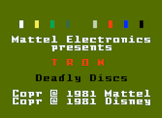
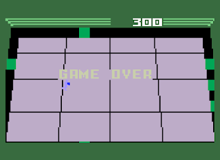
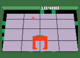
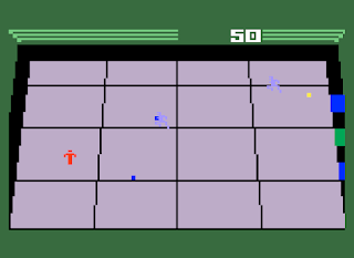
Deadly Discs is taken from the one scene in TRON with the throwing discs that killed people. I barely remember the film, sorry. TRON games seem set up around the gladiator games in the in-game world. There's a whole sub-genre around the light cycle game in TRON, though admittedly that's just multiplayer Snake. As per usual for the era, the game is very simple. Throw a disc at various enemies, dodge their disc. What makes the game special is that the disc functions like a boomerang you can block with. It doesn't hurt on the way back, but you can control how far it goes. This is what makes this game feel special for the time. It feels like a special weapon.
I'm admittedly not sure how this one happened
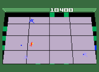
Bear in mind your enemies have this weapon too, you're just going to be smarter about using it. Enemies at the start function exactly like you do, right down to not doing damage to other characters by touching them. And there are up to three enemies at once. For the most part they're going to be the same enemies, later enemies get faster and ones I didn't reach hurt you upon touch.
Its certainly an impressive looking thing
There are two objectives here, the first to fight off the enemies, the second to keep the doors open. You can move through ones you've hit with your disc. Every so often you hear a strange noise and this big...thing comes flying in. At first it seems like its just going to drop something in the center of the screen, but when it lands it starts throwing things at the doors, closing them, and throws a paralyzing attack at you. You defeat it by hitting the little shifting dot at the top of it, anywhere else and the disc will just harmlessly bounce off.
About as far as I got, note the different shade of blue on the top enemy
From there its fairly simple. At 10,000 points a new kind of enemy pops up, which is faster. I assume stronger enemies show up, but I wasn't able to reach that far. The player character is not the usual one-hit wonder, he can take a few hits and he regenerates as time goes on. However, there is a problem with this, where the game draws most of its difficulty, you slow down after each hit you take. At full health you move at a good pace, at minimum you are guaranteed to get hit again.

Weapons:
The disc is a very interesting weapon. Easy to use, hard to master. It doesn't really seem that much better than the rest of the shoot once, wait for shot to disappear games that are typical of the era, but its a lot better in practice. 3/10

Enemies:
Your typical assortment that gradually gets stronger as you go. The semi-reoccuring enemy that doesn't actually kill you is new, and his appearance shakes things up quite a bit. 3/10

Non-Enemies:
None.

Levels:
None, really.

Player Agency:
Moving around is exactly what it needs to be. Controlling the disc has a curve, but actually aiming it isn't a problem. Damage reducing your speed is annoying, but more colors would probably break things. 5/10

Interactivity:
None.

Atmosphere:
None.

Graphics:
Simple Intellivision graphics. 1/10

Story:
None.

Sound/Music:
Surprisingly effective for the Intellivision. They don't feel like the usual blips and bloops, although the sound of the disc bouncing off something was used in something else. 2/10

That's 14. About average for the Intellivision at this point. A pretty good start for licensed games, though there don't seem to be any more until 1983. Curiously, there's a remake of this game in the works for the Intellivision Amico...which I'm sure won't go over like every other microconsole has this past decade.

Dimensional Fighter Epsilon3 is proving both very long and very boring, and thanks to its status as the first FPS/RPG hybrid, its not exactly a game I feel like I can give up on. Shorter games will be the rule until I either win or finally hit a brick wall.

Tuesday, November 23, 2021

Midi Maze


The title has been spelled a lot of ways, but since the two words are consistently separated, I have it like that
Name:Midi Maze
Number:91
Year:1987
Publisher:Hybrid Arts
Developer:Xanth Software
Genre:FPS
Difficulty:3/5
Time:

While it may not look it today, Midi Maze has a very interesting place in history. Games before Midi Maze aren't really FPS titles, at least not as we've come to think of them. Yes, some are very impressive, but they've always got some weird thing going on that separated from the commonly accepted ancestors. Either they're grid-based, they use some crazy keyboard aiming, or some other strange caveat. This has all the hallmarks of the genre I've come to love and hate over the years.

Midi Maze isn't the first in its lineage, its pretty clear that its inspired by the mainframe game Maze Wars. That's the game usually credited as being the first FPS, though I still consider this to have a weird thing, since its grid-based. I don't think we've actually seen a game influenced by Maze Wars before, outside of this game's sequel/remake. While other games have the same grid-based movement, the Maze Wars formula is pretty clear. You wander around a maze, you shoot things that are also wandering around and shooting. The closest thing I've seen is Illegus Episode IV, which I compared to 3D Monster Maze, another mainframe game, though that has some home computer ports.

There's also another important aspect to this game I'm not really going to go over, multiplayer. This is where the MIDI part comes from. On an Atari ST, where you would originally play this game, you could take up to 16 MIDI cables, attach them to each computer, and you and your friends could blast each other as long as you cared to. I think this is actually the first game you could play like that. It was actually the primary draw for the game back in the day, since there was nothing like this. People were still playing multiplayer strategy games by mail.

Starting up a solo game is slightly confusing and requires one to press alt+s when the game says slave machine. From here you can select the map, what your name is, and what kind of bots you have. They are very dumb, dumb and not so dumb. I start off with the very dumb ones to get used to the controls. You need to pick a regular joystick, not joypad or anything else, otherwise you won't be able to do anything. The dumb ones prove to be ample target practice.

A typical scenario with the stupidest bots
Moving up to dumb ones, they shoot back. There are a couple of interesting things going on here. First, when the AI isn't chasing after you, they're going around in a circle. Second, they will ignore any other AI to just gang up on the player. This provides a few amusing situations. If I'm shooting at the AI from a certain distance, they will do nothing. Which can and has resulted in three AI just going into a circle while I take pot shots at them. The goal, though there are changes to the objective that can be made, is to kill your enemies 10 times.
How polite
This situation with the AI only going after me prompts me to change the map and lower the amount of AI down to one. The AI on not-so-dumb seems a lot more clever than it really is. It'll still blandly shoot at me if it's got a good shot, but when it's not taking shots at me, it looks like he's running around a lot better than he really is. Perhaps it was just the map being better suited to the AI, but I felt this was a worthy challenge.
Unlike his stupider fellows, this guy isn't staying there for long
There is also a team mode, which is chaos. If every team has four members, and every team's kills are combined, its fairly quick to get to the kill limit. You need a really big map to properly handle everything.
Utter Chaos
The game, in addition to what kind of bots you want, also allows you to chose firing speed, respawn time, and regeneration time. This functions a lot like your newer FPS titles, where the gun isn't so important and you have regenerating health. However, you regenerate pretty slowly even on fast. There are plenty of mazes included, and a map editor if you're so inclined.

Its a lot of fun, even if I'm missing the point without other players. I'm not sure you can play this version with other players, at least not without real Atari STs. You miss a lot by not being in a room with 15 other people, screaming German curse words. This is really a different experience than most multiplayer FPS titles, because there aren't really any that play this simplistically. There's not even sidestepping in this. Instead of circle-strafing you get two people trying to walk at a safe enough angle.

Weapons:
Generic weapons. 1/10

Enemies:
Some smart enemies for the environment and era. They do have limitations but on the whole, its not like there was anything to compare it to and its not really the point. 2/10

Non-Enemies:
None.

Levels:
Fairly generic, only walls on-top of blocks. 1/10

Player Agency:
Despite having some issues getting it working, and only allowing simple moving and shooting, it felt very smooth. It would have to be, even in the absence of any competition. 4/10

Interactivity:
None.

Atmosphere:
There's something weird about playing in a ghost town of a game, especially one as weird as this. 2/10

Graphics:
Very simple avatars and walls. 1/10

Story:
None.

Sound/Music:
Some generic sound effects. 1/10

That's 12. A bit more than Faceball 2000's 7. Curiously, this is exactly the same as Choplifter, though the individual scores are different.

This is it for Xanth Software, I've already covered Faceball 2000, and while they're credited on GATO, that's just a port. Hybrid FX doesn't seem to have been responsible for anything else.

I have the upcoming games planned until game 100, which hasn't changed at all despite shifting gears.

Wednesday, November 17, 2021

Dungeon Master

Name:Dungeon Master
Number:84
Year:1987
Publisher:FTL
Developer:FTL
Genre:RPG
Difficulty:4/5
Time:15 Hours 40 Minutes

While highly influential in general, Dungeon Master marks a shift in the design of first-person non-vehicle action games from maze games to something with actual gameplay. Even a good chunk of RPGs before this were just complex, multi-level mazes. Meanwhile, while the rest of the gaming world is slowly advancing beyond wireframes, here comes Dungeon Master, looking fantastic and playing great, with this fancy mouse thing. Nothing can compare to what this game accomplished.

These "trolins" are your typical orc-type monsters and usually come in groups like this
That's not to say it doesn't have issues with how it looks and controls. The game is very grey, but having unimportant bits desaturated can be a net boon to visibility, outside of those pesky hidden switches or grey keys. Yes, there are some details in the artwork that could be improved, and there could be longer animations, but what is here works well. The primary issue this game has is that its in a dungeon and dungeons are ugly. Its either grey or brown or grey-ish green. If you don't know what you're doing in expanding that, you could very easily make something that looks worse than generic dungeon.
A very bad situation, these wasps poison my characters, so Sonja is just about to die here
And on the control front the issues are minor. You can control everything with the mouse, but keyboard shortcuts are common for offensive and movement actions. In the version I played, which is the Chaos Strikes Back port, the numpad controlled my movement. You have the usual forward, back, left, right, but the only turning is left and right. Not much of an issue here though. You can attack by clicking on a weapon, or by QWER and the three letters below these. Attacks (and spells) have cooldown times, based on how strong they were. Meaning you don't want to have your melee fighters cast fireball before entering combat, and enemies with higher defense should be dealt with weaker attacks.
A "giggler" fresh off having stolen a shield, the other having already been stolen
The inventory system is limited by both a number of slots and the character's strength. Exceeding the number of slots is possible by getting chests, which you'll need soon enough. Exceeding the strength limit...is possible, but very poor judgment. This decreases your stamina faster, and stamina is something you'll want to keep up. It is possible to restore stamina with potions, and it, like every other point stat restores on its own, but its something one's concerns are better focused on elsewhere.
Another very bad situation
One thing I didn't care for was that you didn't really know what an item was or did beyond the name. There are a lot of enchanted items I didn't know if they were any good or not, simply because they were just some item. Weapons didn't really seem to get better as time went on, they just got special abilities. Items that had special uses had to be put in the right hand slot, be they chests that give you more carrying slots or empty potions to be refilled. Its all just mildly inconvenient, not truly bad. Something unnoticable when you're actually playing it.
Sometimes it seems like the dungeon has an actual mind of its own
The spell system is part gameplay and part copy protection. You have four sets of six runes and using these runes allows you to successfully cast spells. Success also depends on a character's level. However, I felt the game was biasing me towards casting healing spells and fireballs, as more complex magic spells aren't worth the mana they cost, outside of a few rare situations. Spells are divided by schools, but there's not really any non-offensive spells for wizards (outside of a light spell you need) or decent priest offensive spells.
Throwing a chest at nothing, practically as effective as regular throwing weapons
Combat is interesting. In theory you cast a few spells at an enemy, then your melee characters duke it out while the guys behind use ranged attacks. Like most RPGs. The issue is that you can almost never duke it out with enemies. You need to do something commonly called a combat waltz, where you constantly try to run behind an enemy and hit them there. Most enemies have higher health than your party members. This works better on some enemies (and some levels) than others. The environment is very important in this too, as doors hurt everyone. Including your enemies. And in usual RPG fashion, enemies take more damage from some types of damage than others. Positioning is important too, enemies attack the two party members they're nearest, which if they're not in front of you, means one of the squishy mage types is going to have to fight. Its entirely feasible, albeit not practical, to fight off enemies in two different locations at the same time.

A sentient suit of armor, which doesn't take a lot of damage from physical attacks
The RPG aspect is very simple. There are four skills, fighter, ninja, wizard and priest. Ninja governs range attacks. Each character can freely advance in each skill, but in practice the front characters are going to be better at fighting and the rear characters better at the rest. However, its still useful to have everyone balanced out, not only for more magical attacks, but also because the characters attributes improve as their stats do, and having more mana and carrying capacity is useful. The latter two are a bigger concern as time goes on.
A mysterious field, there are many of these to figure out
Gameplay in Dungeon Master is unsurprisingly enough, a dungeon crawler. Create a party of 4 adventurers and have them explore a 14 (roughly) level dungeon. Preventing you from accomplishing this goal are monsters, puzzles and the party's desire for silly things like "food" and "water". The game has hunger and thirst meters. At first you get plenty of the stuff, but as time goes on it gets in stricter supply. If you're not careful, you can find yourself in a position where your party has no way of getting to water and food sources. After all, your characters are spending many days in a dungeon, its only natural that they want to eat.

Much of the early levels is spent getting used to the mechanics. Befitting its age, the player has to make his own maps, thanks to a lovely mechanic called "spinners", which spin the party around. Its not the first time I've seen it, and it isn't the first time it would be a mechanic in a RPG, but it feels a lot more insidious here. You have to pay extra attention for them, very tricky in a grid-based system where giant rats are barrelling towards you. To survive one needs to be alert and pay attention. That pressure plate in the floor may open a door or it may open an invisible hole in the ground. I'm pretty sure you need to press a few hidden switches and buttons to win, but since you have to be alert its not as big a sin as any FPS guilty of doing it.

Note the cursor on the door button, one of the few times the mouse is useful in combat
Once you get used to it, the game really comes into its own. This is where the puzzles really start to shine. These heavily involve the dungeon's environment and get very complex. For a game that's basically the first of its sub-genre it feels like it exploits the mechanics of the genre to the fullest. I had to look up things a few times and it seems like when I did, it was usually because I didn't expect the game to be able to do that. Something of a flaw in my reasoning before now, I admit, but holy crap, this feels like a top-notch fan mod rather than an actual commercial product.
A sample non-material enemy

The game has the right length, lacking any real fat to it and just about hitting the practical limit of player offensive ability. Any shorter, and one might not be properly prepared for the final bosses. Any longer, and the player will reach enemies with far too much health. Now admittedly, the last real level has a bit too much in the ways of enemies that take too long to kill. This doesn't make that level bad, just very annoying.

There are a few negatives. Like a few instances where continuing isn't ideal and that it should be time to reload. I can resurrect characters after they die but there's no real boon to this. Resurrection chambers are very far apart from each other and going to them isn't ideal. Further, this permanently lowers the HP of that champion. Despite how it might seem at times, I am trying to play these the way they were meant to be played, its just that doesn't always work out. I also don't care for the "gigglers" or thieving gremlins. They steal an item and then run off. There's one big floor with dozens of enemies and pits in the way of dealing with them, and I don't feel bad about reloading should I end up there and lose an item.

These "wizard eyes" can open the door just as well as you can, which is unfortunate
I also found some of the special enemy kinds to be more annoying than worthy foes. Most poison enemies required constant cure potions. I'm pretty sure I used more cure poison ones than regular healing ones. There were enemies that were non-material, which couldn't be harmed by regular attacks. I needed to use one special sword or a specific spell to take them out, which was clever at first, but by the end I was trying to just avoid the ones I could. I finished the game without killing them, so it worked.
Dungeon Master is an interesting game, at times it feels like the last and truly wonderful title of the sub-genre and others it feels like the awkward first game. Its an amazing game and technical achievement. I'm not sure how you could improve upon it, but I'm sure we'll see someone try.

Weapons:
I didn't really notice much difference between the swords I started the game with and the swords I ended the game with, outside of magic powers. Offensive spells, on the other hand, tended to force me to use fireball, with poison attacks being too unreliable and lightning too mana-intensive. Ranged weapons never seemed to be too effective and required too much cleanup. 2/10

Enemies:
There's a nice variety of enemies, albeit ones that fall into the usual category of fantasy monsters. Giant insects, orc-types, undead, beholders, demons and dark lords. There are a few against the grain, but nothing too out of the ordinary. It has a nice progression, but things were getting into the damage sponge range by the end of it. I didn't care for some of the respawning enemies, however. 5/10

Non-Enemies:
There weren't any.

Levels:
There's some interesting highs, the better ones had some very interesting puzzles in-between the fights. Secret searching is pretty good, not only thanks to the methods of finding secrets, but in how they're placed. The lows are mostly just busy-work, having to fight one's way through potentially never-ending meatshields. 7/10

Player Agency:
The method of controlling the characters along a grid works pretty well, compared to later attempts. All my issues really boil down to not being able to change items easily in combat. There's no way to heal in battle easily, going to inventory while fighting is going to end very badly. 7/10

Interactivity:
There's some interesting stuff going on that I haven't seen before. Take secret walls. In a normal FPS, you'd press use against a wall, or maybe shoot it. Here, you can't do the former, and the later does nothing much. Instead you press it, with the mouse. You can also run into walls, which damages you. The game offers a similar amount of cleverness in other aspects. One memorable puzzle involves putting down items to activate pressure plates so you don't get roasted by fireballs. 5/10

Atmosphere:
Despite lacking music or any kind of ambient sound, Dungeon Master did a good job of making the player feel like he's deep in a dungeon. Too many games gloss over the whole eating and drinking aspect of dungeon crawling. 4/10

Graphics:
High-quality for the era, but now just competent. The game mostly suffers in that what its depicting most of the time isn't going to look great no matter how you render it. 4/10

Story:
Not something that really matters for the most part. It is cool that one should figure out that Lord Order isn't a friend, but otherwise it doesn't exactly have much of a presence. 1/10

Sound/Music:
There's no music in the version I played, but there were action sound effects. Simple but effective. 3/10

That's 38. I'm giving it 2 more since its such a vital, if understated game. For a final of 40. That's the lowest of my recommended category, as the 30s usually fall under recommended if you like that sort of thing. I don't really need to go into the reviews, since its more or less a beloved classic. Its not really a FPS, but its DNA would contribute quite heavily to the genre.

FTL Games will return with the expansion Chaos Strikes Back at some point in the future. The next real RPGs I'll touch upon are the Ultima Underworld games.

I'm trying to shift the upcoming games between genres and nationalities. Expect a Japanese FPS, a racing game, an American FPS, and then an Intellivision game. It turns out I was unable to play The Wreck.